QUICKCARE
SECTOR
Healthcare
SERVICES
Brand identity
Brand strategy
Brand implementation
Exterior sign design
Interior sign design
QUICKCARE
How do you symbolize a service that is for emergencies... but not huge emergencies?
KSD began working with QuickCare before they opened in 2008. From the beginning, the visual identity and messaging needed to attract patients with minor emergencies while making clear that more serious injuries belonged in the emergency room.
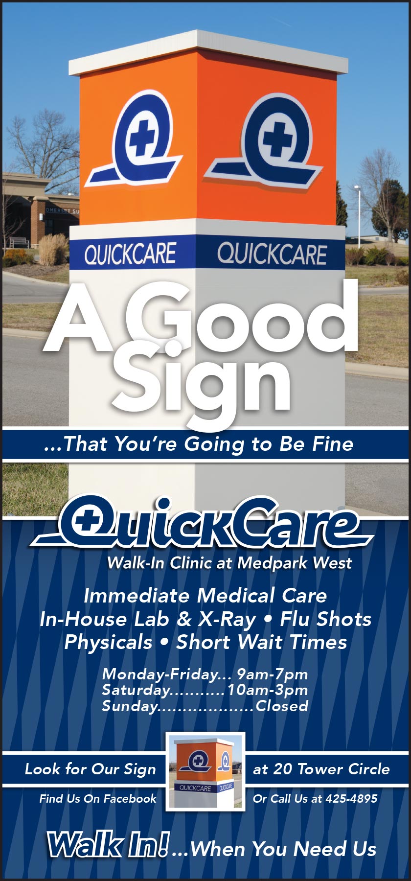
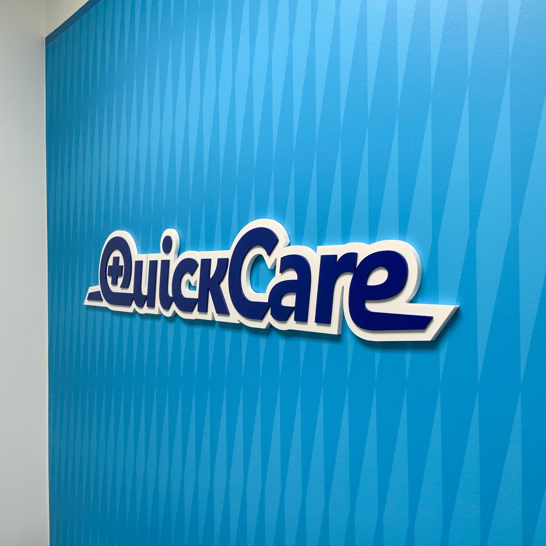
The design establishes that distinction by pairing elements that suggest urgency with a calm response. The tall diamond shapes in the background pattern appear throughout QuickCare’s marketing, social media, and signage. Their rhythm, pointed forms and off-kilter angle evoke the sharp repetition of flashing lights and sirens of an emergency situation.
QUICKCARE
How do you symbolize a service that is for emergencies... but not huge emergencies?
SECTOR
Healthcare
SERVICES
Brand identity
Brand strategy
Brand implementation
Exterior sign design
Interior sign design
KSD began working with QuickCare before they opened in 2008. From the beginning, the visual identity and messaging needed to attract patients with minor emergencies while making clear that more serious injuries belonged in the emergency room.
The design establishes that distinction by pairing elements that suggest urgency with a calm response. The tall diamond shapes in the background pattern appear throughout QuickCare’s marketing, social media, and signage. Their rhythm, pointed forms and off-kilter angle evoke the sharp repetition of flashing lights and sirens of an emergency situation.

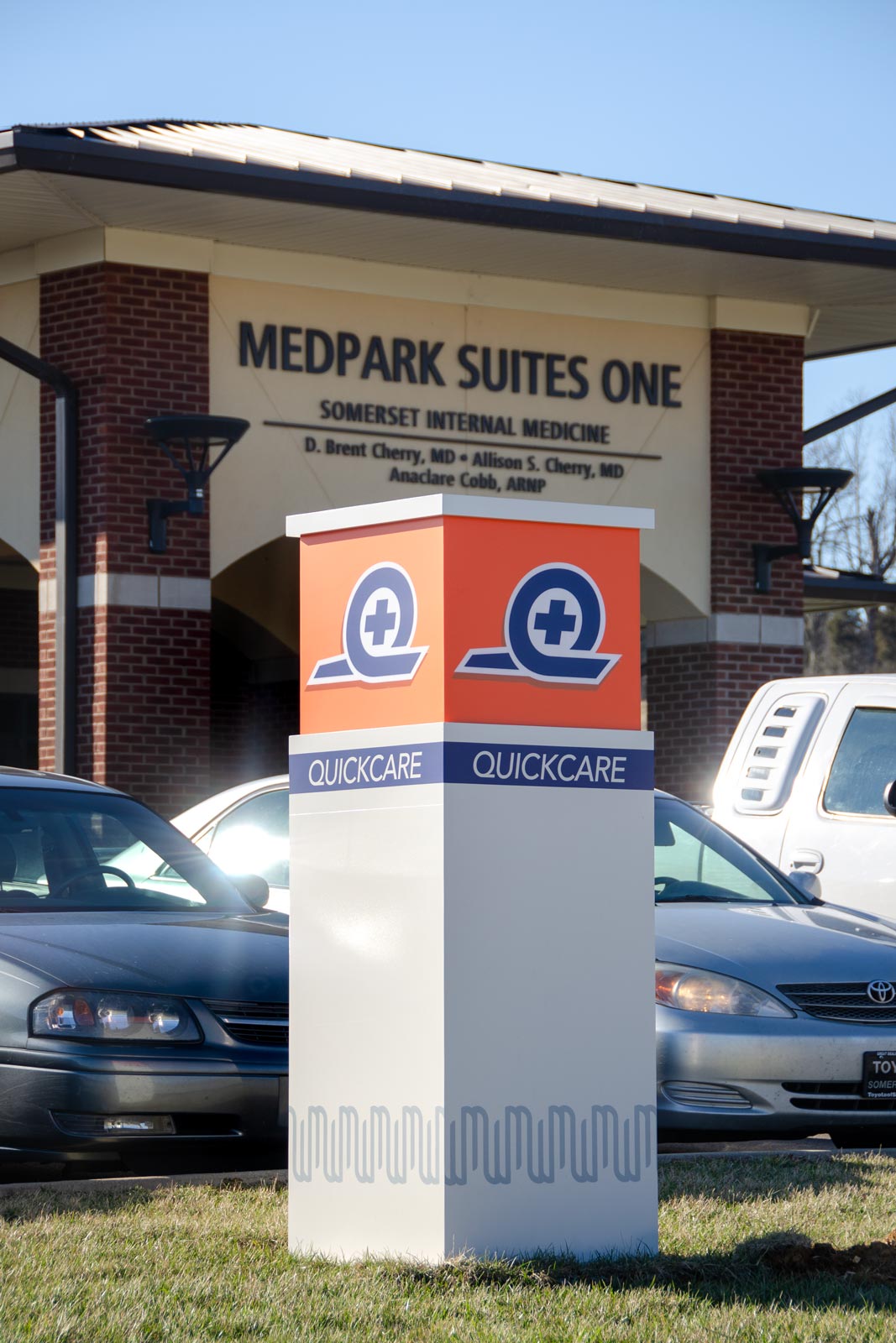
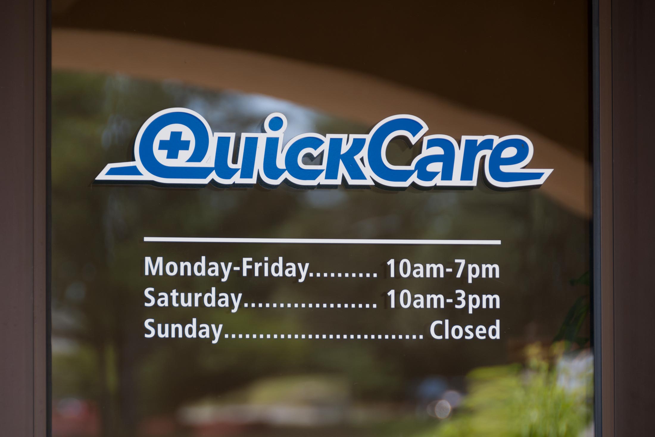
The logo takes a lighter approach. The breezy Q circling the medical cross suggests a quick, easy visit: you’re in, the doctor patches you up, and you’re out.
Interior signage included both room identification and operational signs to help patients navigate their visit. For the Exam Rooms, KSD developed a special format that combined room identification with a clipboard holder the clinic used to manage patient visits.
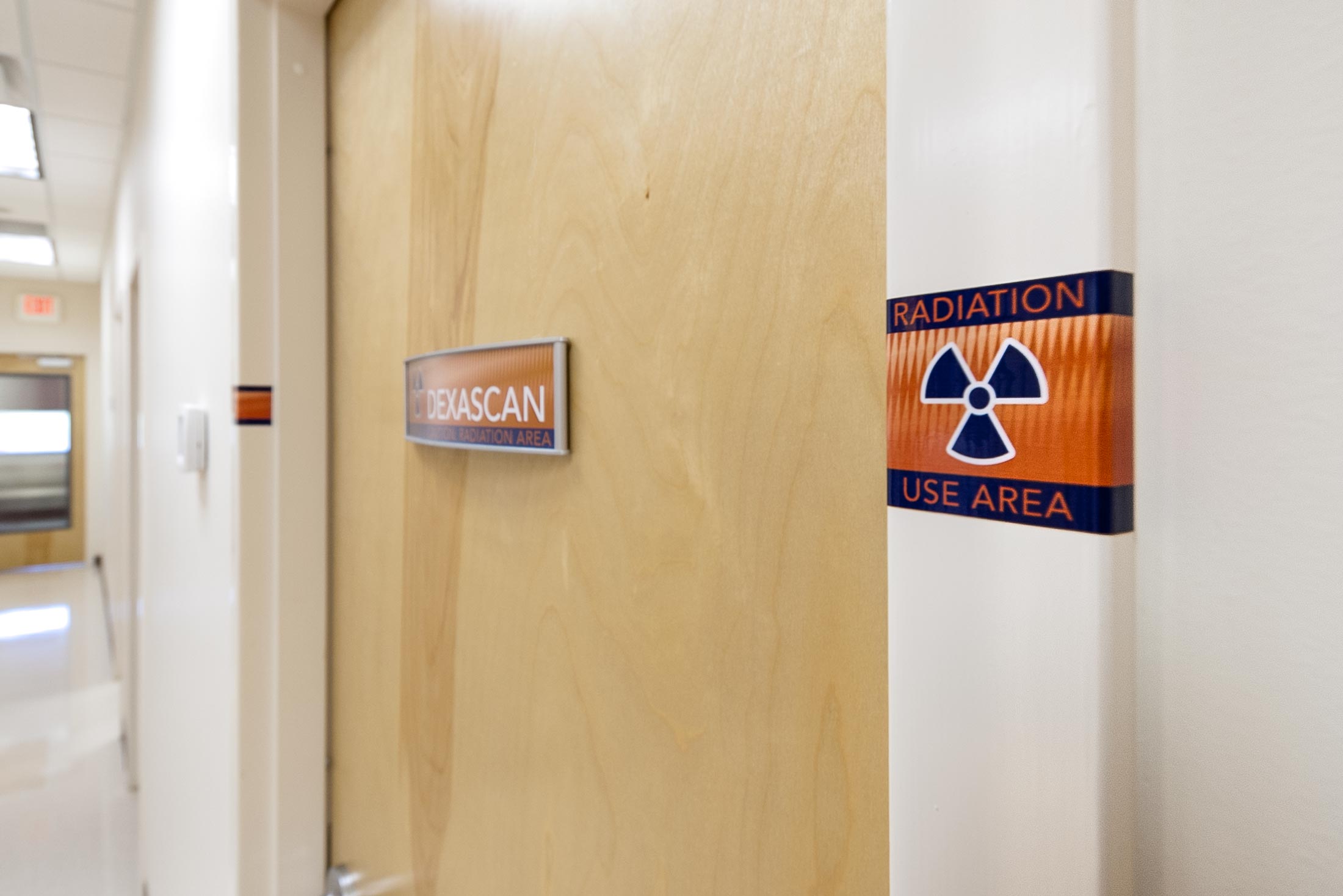
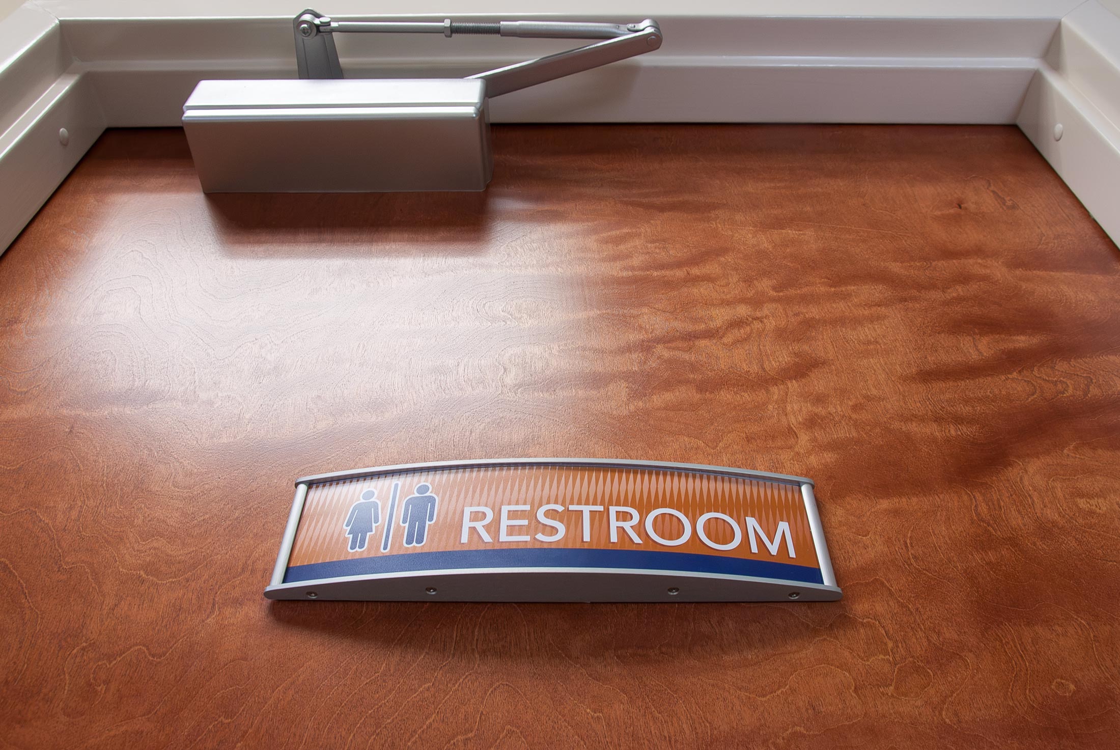
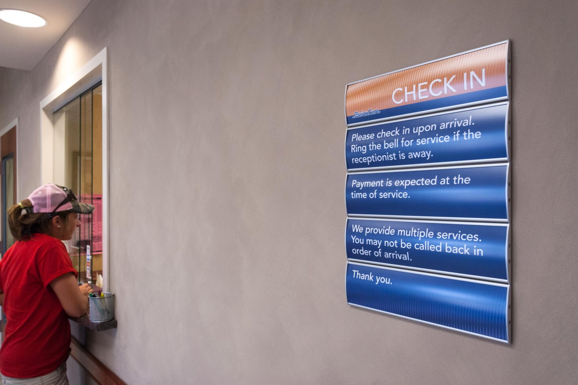
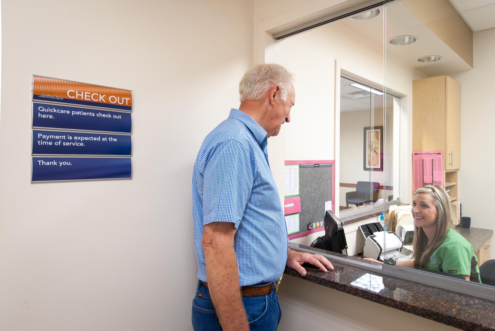
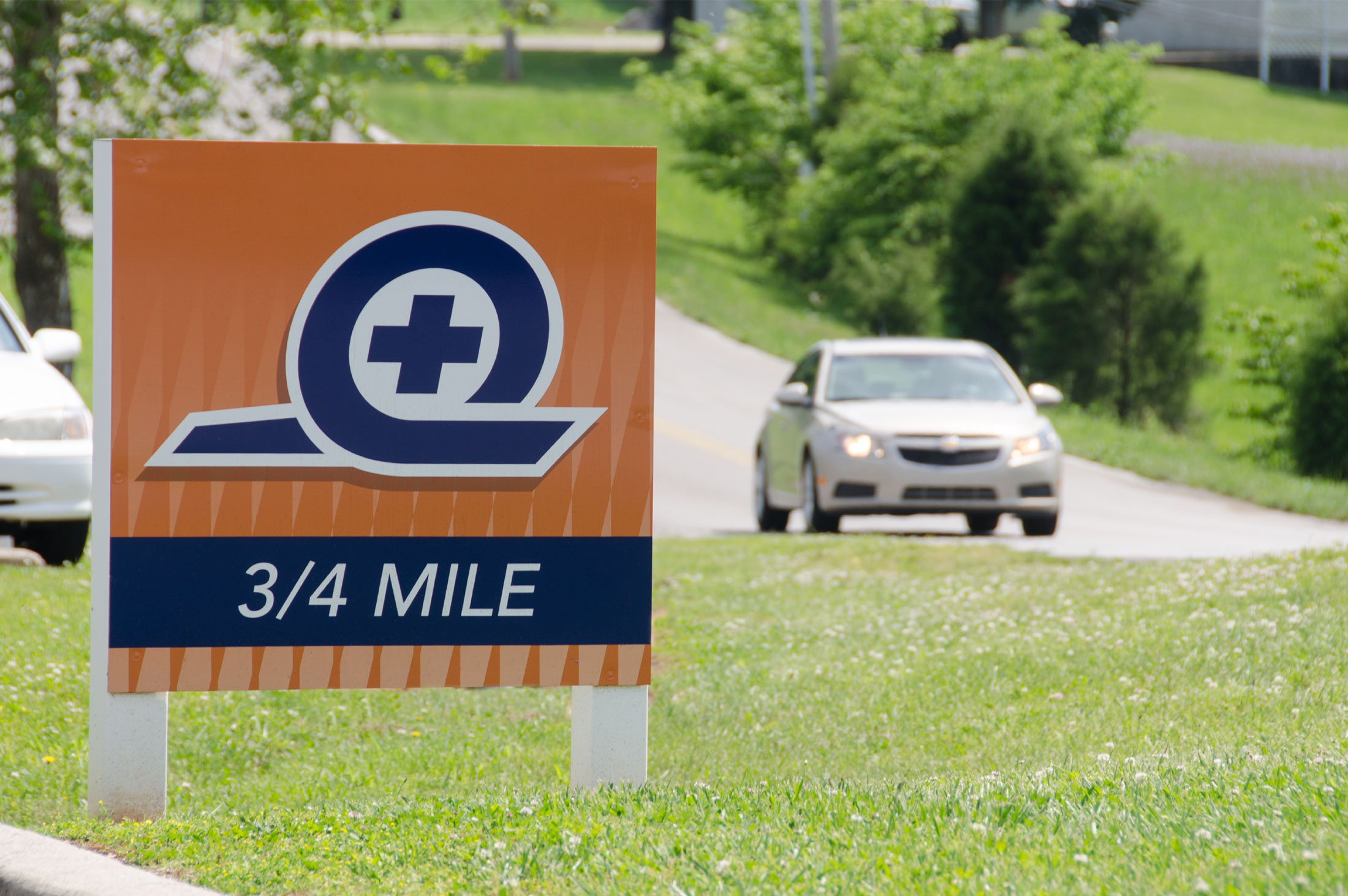
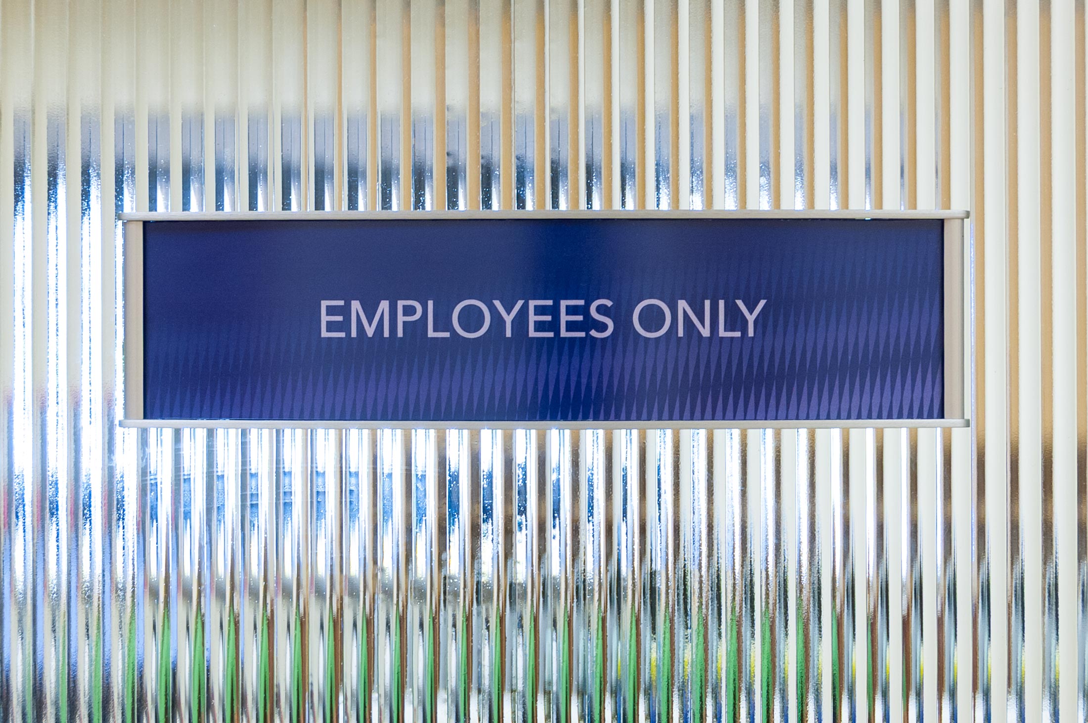
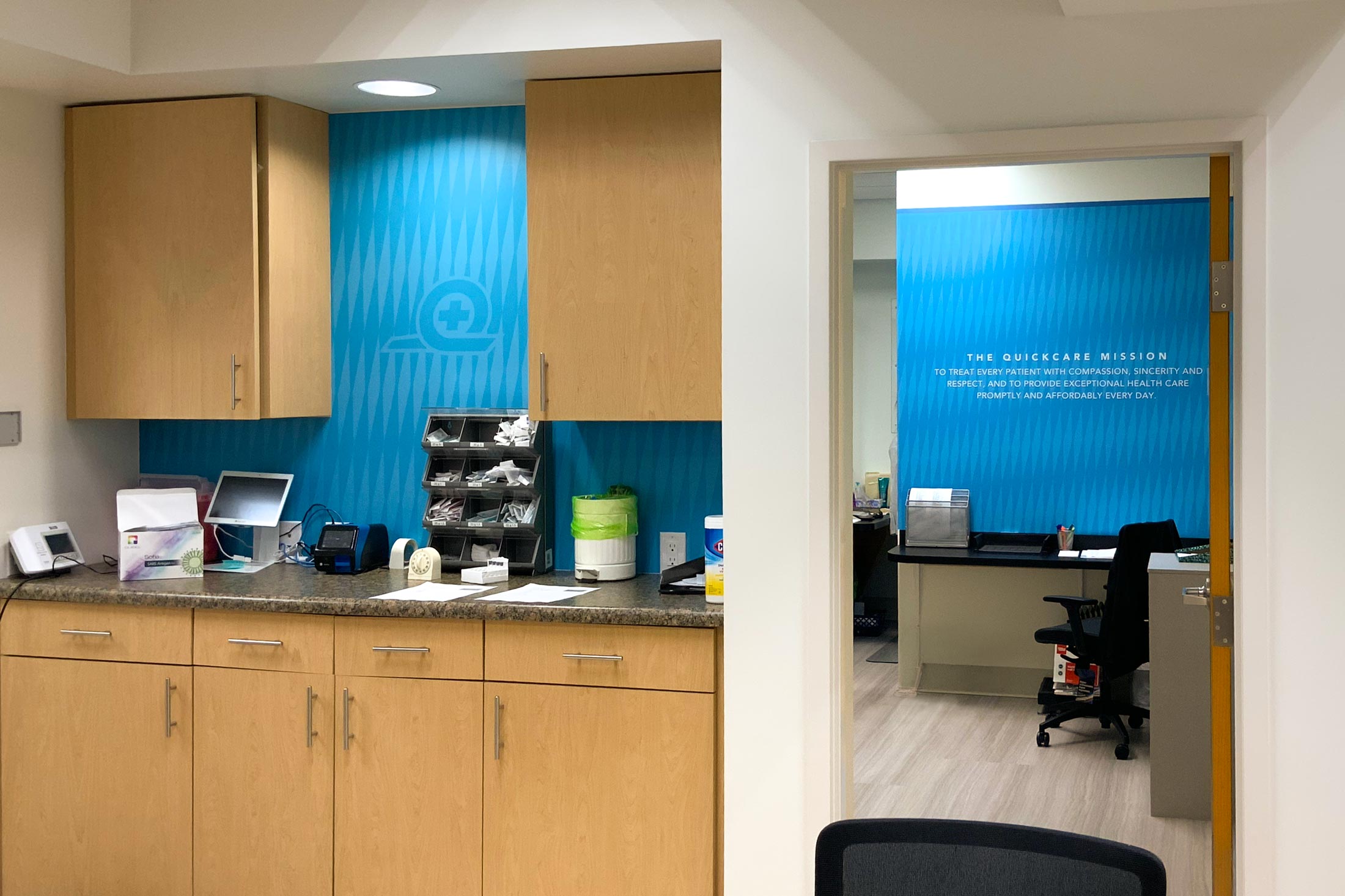
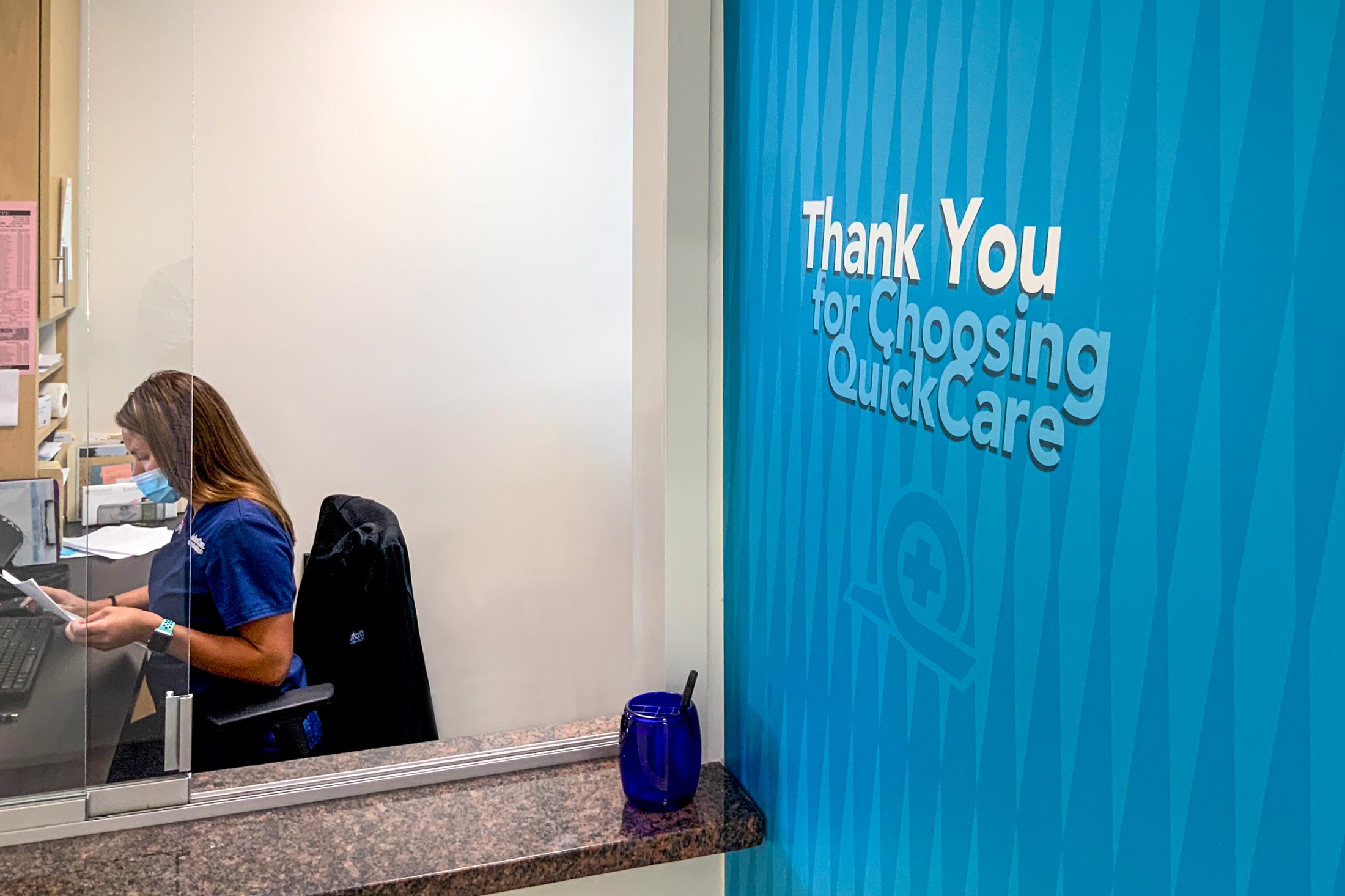
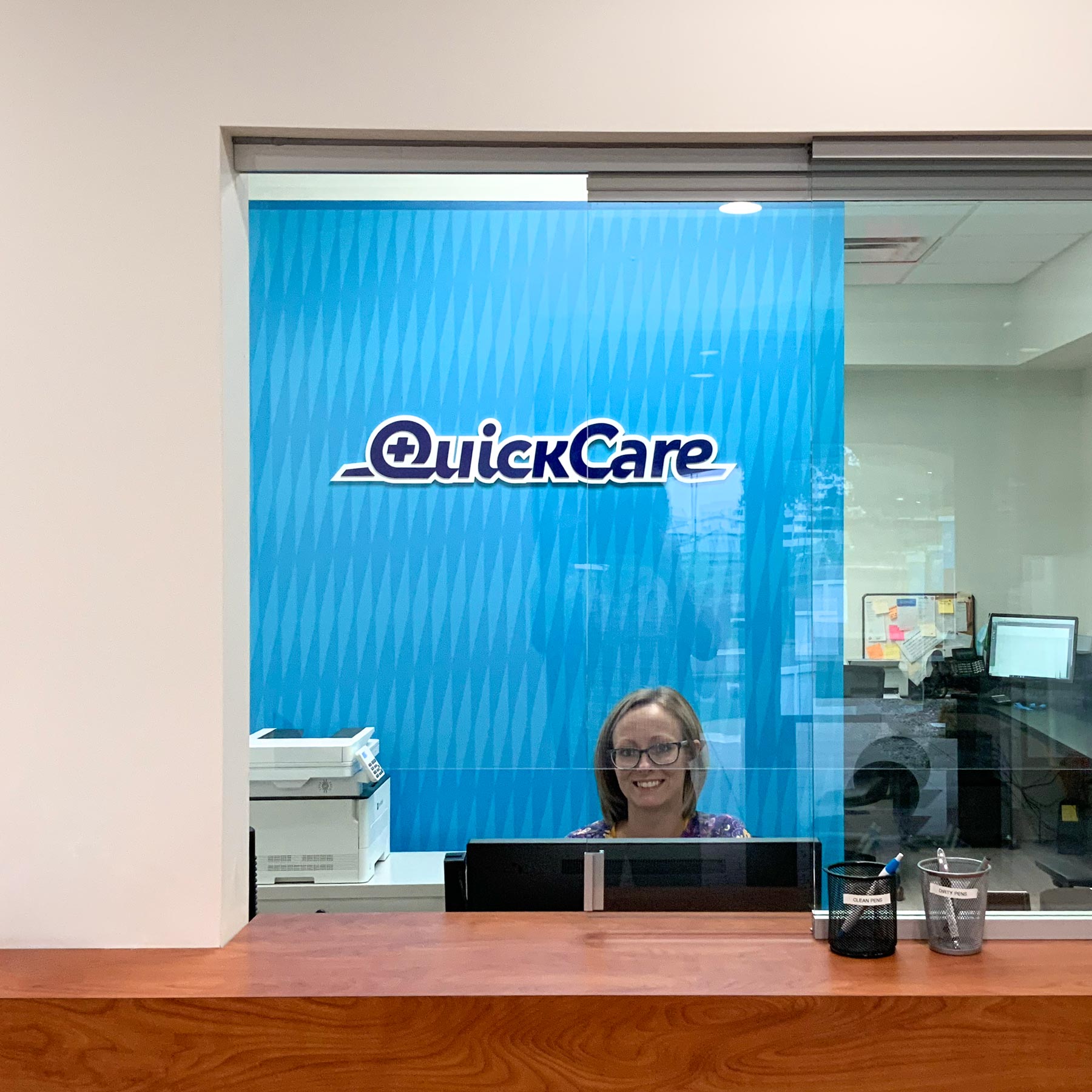
After a decade of operation, the clinic underwent an interior renovation. As part of the renovation, KSD refreshed the branding, bringing the newer look established in marketing and social media into the physical environment.
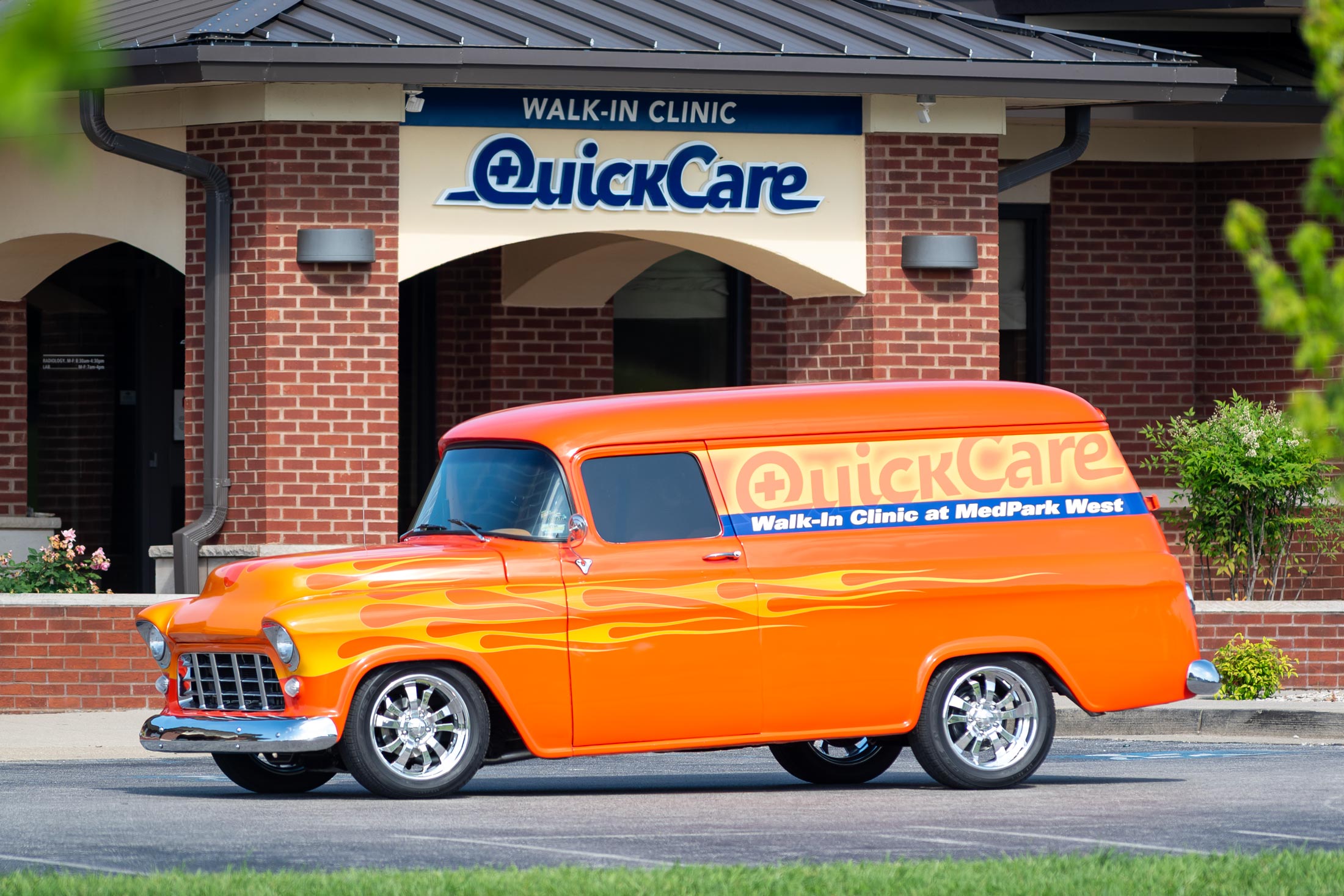
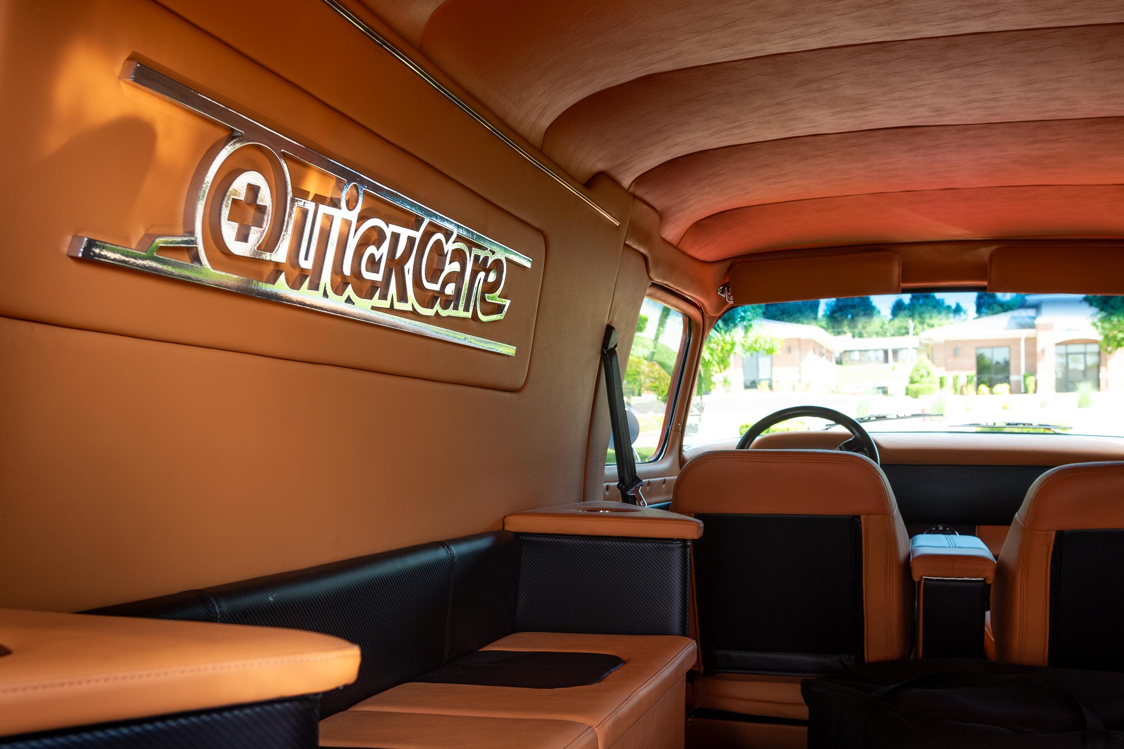
One of QuickCare’s owners and primary physicians bought this classic panel delivery van, and we were happy to help turn it into a unique and fun form of mobile marketing for the clinic.