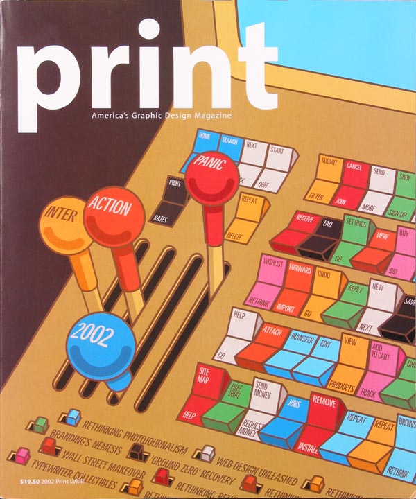
It’s hardly news to our readers that things have been, one might say, a bit shaky in the dot-com market during the past couple of years. Its decline, already accelerating when we put together last year’s annual, continued throughout the following year, abetted by the recession and the events of September 11. Thus, we weren’t surprised that the number of entries in this year’s Digital Design Annual competition fell by 40 percent from last year’s total of nearly 1800 submissions. During a day-long sellion held at Pentagram’s New York office, our five judges–design writer Andrea Codrington, Warren Corbitt of interactive design firn one9ine, artist/digital designer Andrea Dezso, Web developer John Parsons, and Pentagram partner Lisa Strausfeld–viewed about 100 digital projects culled from that reduced total.
This year’s entries, though fewer in quantity, were certainly not lacking in quality. We saw outstanding examples of organization and navigation, with some projects layering a staggering breadth of content in very user-friendly ways. We saw surprisingly clever solutions for circumventing low-bandwidth limitations, and we viewed sophisticated design as well as refreshinly humorous projects–all coming from a wide range of sources. Small companies, students, and individual artists are well represented in these pages as are nonprofit organizations, which produced some surprising and beautiful work. These designers put digital media to new uses–from promoting causes or student art shows to showcasing individual art projects and teaching children.
Whatever the content on display, the software of choice remains the same as last year–Flash. The vast majority of the winners used this program to create animations, screen transitions, dynamic interfaces, and other surprising “Easter Eggs” in their Web sites and CD-ROMs.
Some of the more entertaining and original uses of Flash this year were in the “loading” graphics and screen transitions that distract users as they wait for the big payoff. Some sites tried to mask wait times: Facedesigncom is composed in a grid and loads images square by square, a design maneuver that keeps users from feeling as though they’re actually waiting. Others created witty animations. A construction-themed site, bcgraphicdesign,com, uses an animated bulldozer; the site for Bill Nye the Science Guy loads with an ape evolving into a man; and the site for design firm Concept Farm opens with a man in overalls shoveling a pile of manure.
Designers continued to make strides toward inventive navigation as well. Nonstandard nomenclature was one route some firms chose to create headings with a flair. Design firm Elements used “earth,” “air,” “fire,” and “water” as its menu choices, while One Fast Buffalo multimedia services offered up “hide,” “herd,” and “teeth.” Menus and other interfaces played a dynamic game of tag with us, changing in location, shape, or content from one screen to the next. For instance, the izzydesign promotional CD has a menu that appears when and where the user clicks, and disappears regularly, inviting you to click it back to life again.
Inventive navigation can have its down side, of course. Get too far abstract, and your visitors may give up out of sheer frustration. “One of the big issues was how do you make an experiential site a functional, easy-to-use site,” says David Lipkin, COO of Method, the firm that designed the Web site for The Apartment, a furniture store. “Every time you push a boundary or do something unusual, it’s exciting, but you end up introducing something that people don’t immediately understand. There is always the balance of making something different and making something user-friendly.” Indeed, in many of these sites and CDs, there is a palpable tension between these two sometimes conflicting purposes. Flashy intros give way to more staid, familiar homepage menus. Explosive, exciting loading graphics or screen-change animations treat the user to bursts of boundary-pushing visuals before delivering us back to mre conventional ground. But no matter how cutting-edge a company or designer wants to appear to customers or clients, in the end almost all projects aimed to be utilitarian–if only to provide some contact information.
Despite designers’ attempts to ground their work in usability, sometimes glitz won out over substance. In some instances, so many dynamic elements crowded a site or CD, using so much motion and heavily designed space, that the actual content took a back seat. Animaitons, constant screen re-draws, and flashing or blinking images were often distracting. Other times, the repetition of downright difital cliches (like vertical lines sliding back and forth, or block quotes expanding and fading in from the background) made the project feel dated–and grated on the judges’ nerves.
But, as you can see in the following pages, good work continues to prevail over cliches and over economic blues. From online Lego games to a site educating kids about diversity, “Interaction 2002” has plenty to offer the digital connoisseur.
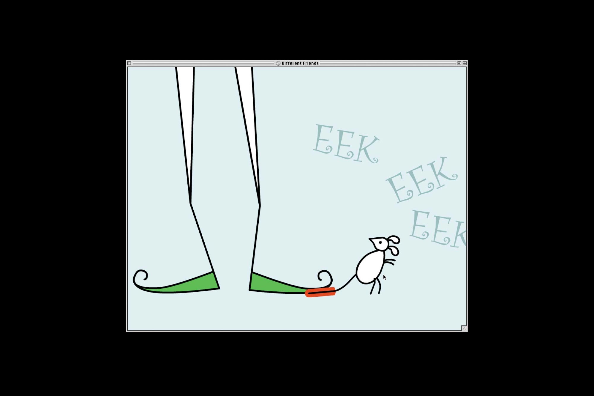
WWW.DIFFERENTFRIENDS.COM (note—this project is not longer active and the site is no longer available)
This project which offers a diversity lesson for children, arose when officials at Pulaski County School in Kentucky wisely decided that first to fourth graders would pay closer attention to an animated, music-driven project than to a printed educational pamphlet. Yet the project couldn’t be too flashy, so as not to confuse its young audience. “Navigation was kept simple,” explains William Cox, one of the designers. An animated mouse walks and dances across the screen throughout the site, and clicking on it will usually take the user to the next step on the journey, or back home. Animation sequences are short, and once they are started, they must be watched in their entirety, which helps both to convey the message and to keep kids from becoming overwhelmed by conplex naviagiton or distracting interactivity.